NESCAFÉ / REBRANDING:
After 75 years, NESCAFÉ® decided to undergo a makeover to strengthen its brand, enhance how people experience its products, and build stronger connections with consumers. Faced with increased competition in the coffee industry, Nestle felt it was time to update not only its logo but also its packaging, customer communication, and online presence. This marked the first time they changed the brand's appearance in 180 countries, including Mexico.
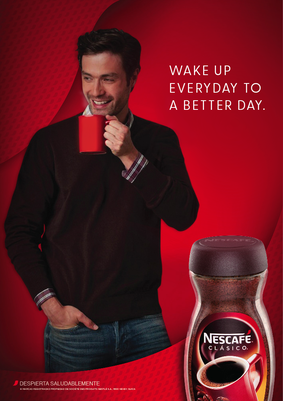
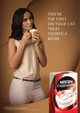
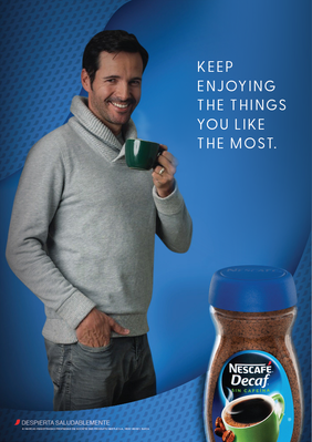
So, we rolled up our sleeves and played a role in bringing the new brand to life. We leveraged the classic NESCAFÉ® red accent that appears across all NESCAFÉ® products, such as Clásico, Decaf®, Dolca®, Cappuccino, Dolce Gusto®, 3 in 1, and Tasters Choice. We launched 200 large and red physical accents in famous parks, avenues, and libraries in Mexico City, Monterrey, and Guadalajara. These accents invited people to “Wake up to enjoy life” with cool sayings. Additionally, we transformed a few larger accents into a coffee shop or a bike station, allowing people to interact more with the installations.
For three weeks, NESCAFÉ® asked its followers on Facebook, Instagram, and Twitter to share photos or stories using #DespiertaALaVida (#Wakeuptolife), with a chance to win prizes.
To showcase NESCAFÉ®'s new look and voice, a 60-second commercial was shot by director Pucho Mentasti, and aired during prime time on TV. The challenge was to create a campaign that included all Nescafé products, each with its unique color, identity, distinct “mug” and storytelling, however all these variations would have to remain clearly connected and embraced by the main Nescafé brand, so cherished by the Mexican people. The NESCAFÉ® accent was consistent as a recognizable signature across all campaign efforts.
As part of the campaign, we also crafted new tabletop coffee shots to balance the brand voice with fresher, more sophisticated and mouth-watering visuals.
|
|
|
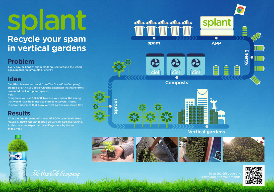
CIEL (Coca-Cola's water brand) / NEW BRAND VOICE:
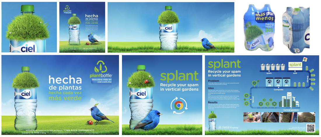
In line with Ciel's commitment to environmental stewardship and responsible use of natural resources, Coca-Cola's water brand introduced PlantBottle® across Mexico. This innovative bottle incorporated 30% BioPET, marking it as the nation's inaugural partially plant-based water bottle. To herald this breakthrough, we played a pivotal role in practically creating a new brand voice effort, implementing changes in strategy and product communication, and even revamping the bottle's label to introduce the innovation across Mexico.
The primary objective was to visually and distinctly convey the brand's shift towards producing bottles that are partially plant-based, underscoring its dedication to environmental responsibility. Diverse communication efforts were implemented, including print materials and animated commercials tailored for digital and TV platforms. The visual elements that animated this rebranding campaign featured grass sprouting from the bottle's cap, a green lid, and three nature-inspired characters: a ladybug, an ant, and a blue bird. These characters infused life into the brand's print and audiovisual communications. They were always set against a backdrop of a blue sky and an expansive landscape of a green field, creating a minimalist ambiance that evoked feelings of purity and cleanliness.
This relaunch played a pivotal role in solidifying Ciel's identity as the water brand that prioritizes environmental concerns unlike any other.
CIEL (Coca-Cola's water brand) / NEW BRAND VOICE:
In line with Ciel's commitment to environmental stewardship and responsible use of natural resources, Coca-Cola's water brand introduced PlantBottle® across Mexico. This innovative bottle incorporated 30% BioPET, marking it as the nation's inaugural partially plant-based water bottle. To herald this breakthrough, we played a pivotal role in practically creating a new brand voice effort, implementing changes in strategy and product communication, and even revamping the bottle's label to introduce the innovation across Mexico.
The primary objective was to visually and distinctly convey the brand's shift towards producing bottles that are partially plant-based, underscoring its dedication to environmental responsibility. Diverse communication efforts were implemented, including print materials and animated commercials tailored for digital and TV platforms. The visual elements that animated this rebranding campaign featured grass sprouting from the bottle's cap, a green lid, and three nature-inspired characters: a ladybug, an ant, and a blue bird. These characters infused life into the brand's print and audiovisual communications. They were always set against a backdrop of a blue sky and an expansive landscape of a green field, creating a minimalist ambiance that evoked feelings of purity and cleanliness.
This relaunch played a pivotal role in solidifying Ciel's identity as the water brand that prioritizes environmental concerns unlike any other.
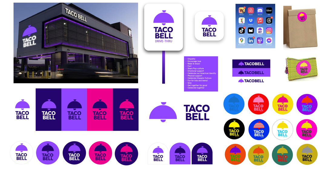
TACO BELL / EXPLORATION:
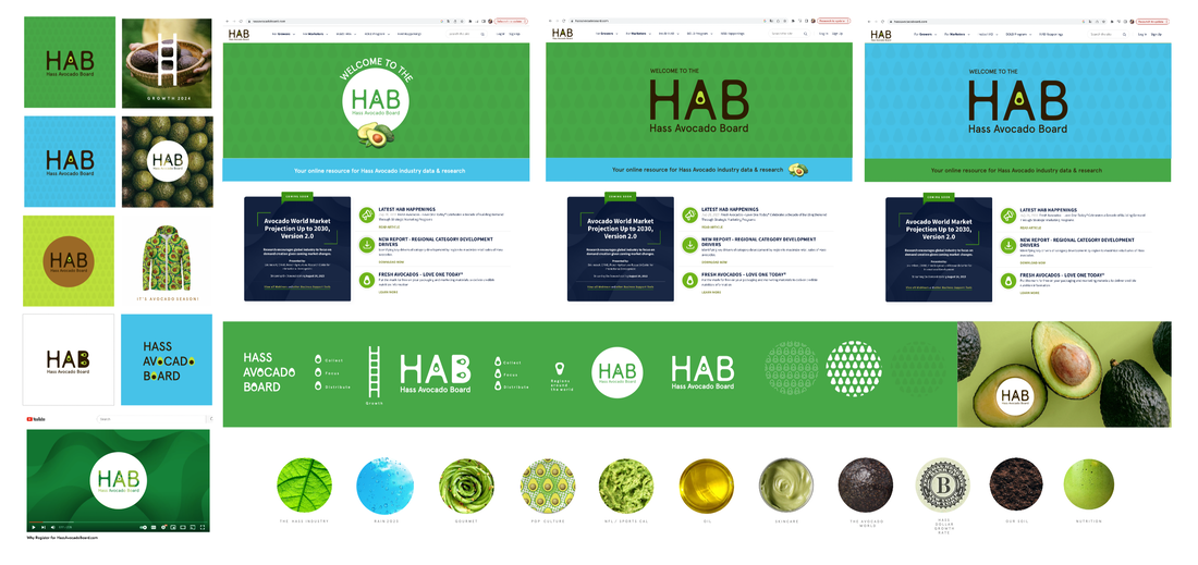
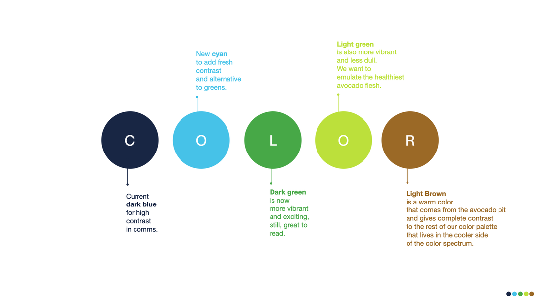
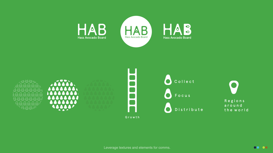
HASS AVOCADO BOARD / EXPLORATION:
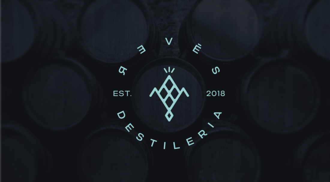
R3VÉS DESTILERÍA / IDENTITY:
A project for Revés Destilería, a Mexican spirits distillery that aimed to create an iconic and modern image for their main brand. Initially, the client had the idea of associating the distillery with horses and the element of an oak tree. However, as we worked together, we all realized that the true strength of Destilería Revés is the fact that all their spirits are corn-based. Since corn is highly sacred for Mexicans, we couldn't overlook that story. Here, you can see a part of the creative process:
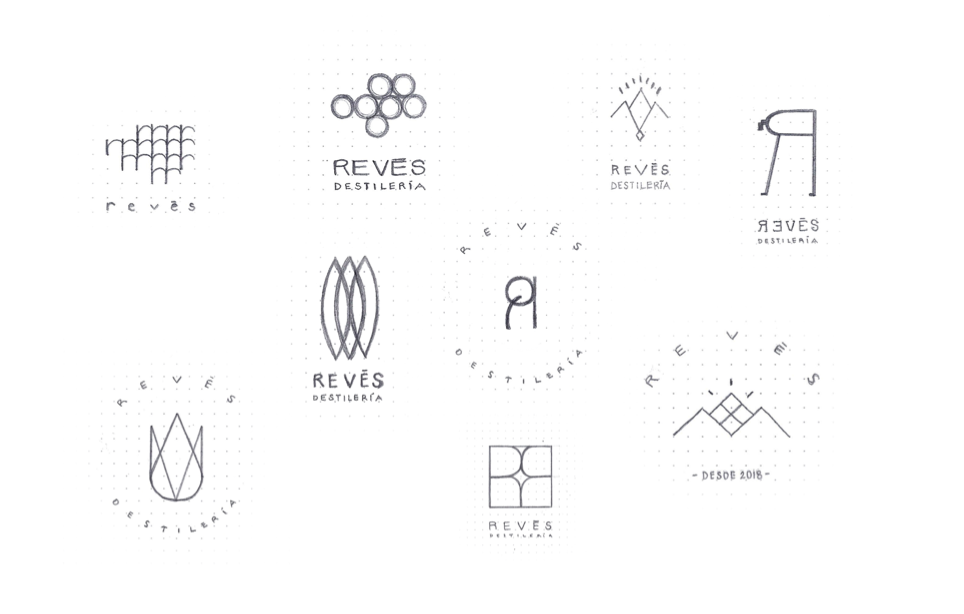
After several approaches, we all agreed to fine-tune the one that honored corn as the ultimate Mexican jewel in a very geometric, classic, iconic, but also contemporary way. We chose a design made up of a corn abstraction with crossed lines in the middle (representing corn texture), accompanied by three shining expression lines on top and a geometric crystallized distilling drop detail at the bottom. Here's the result with various applications:
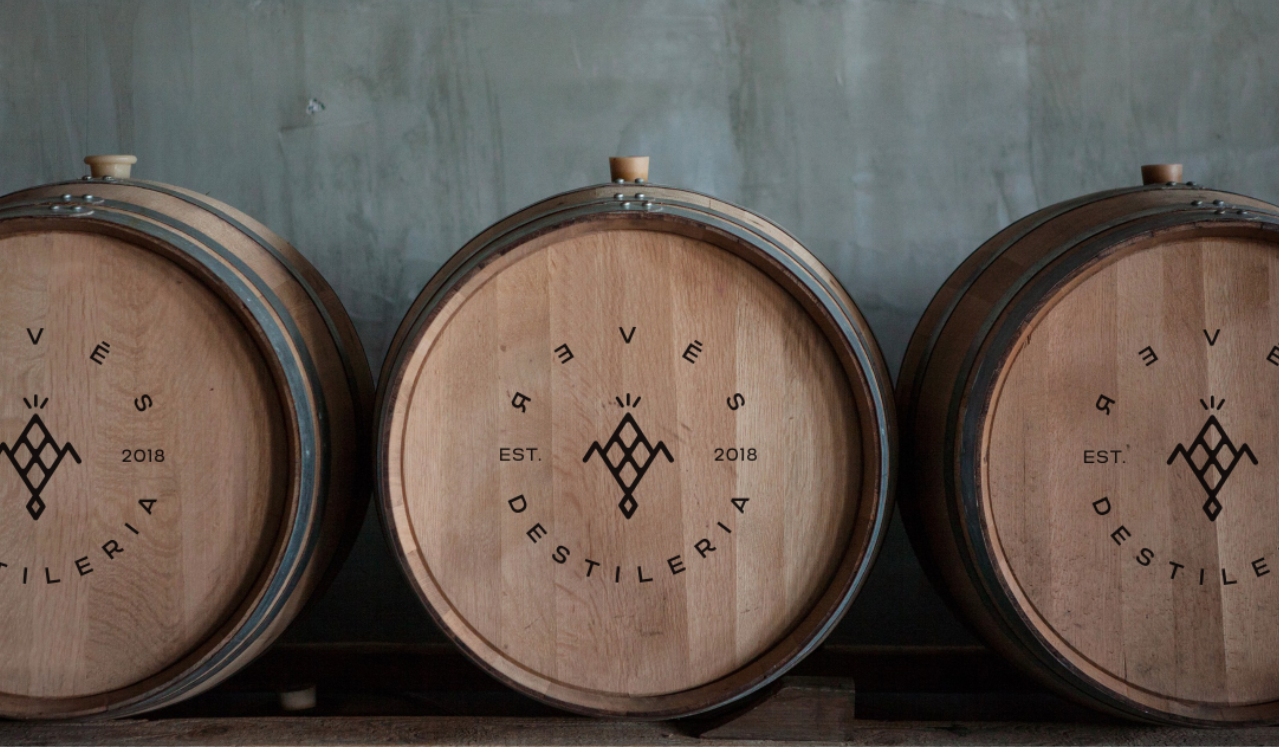
*This picture up here is just for illustration purposes. Not for commercial use. Year also in this visualiazation is a placeholder.
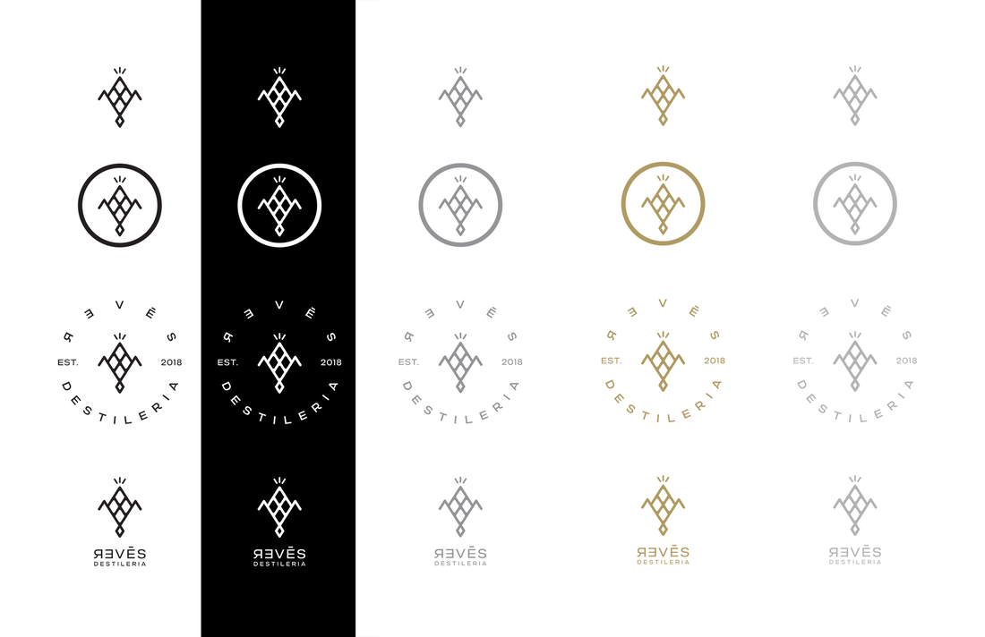
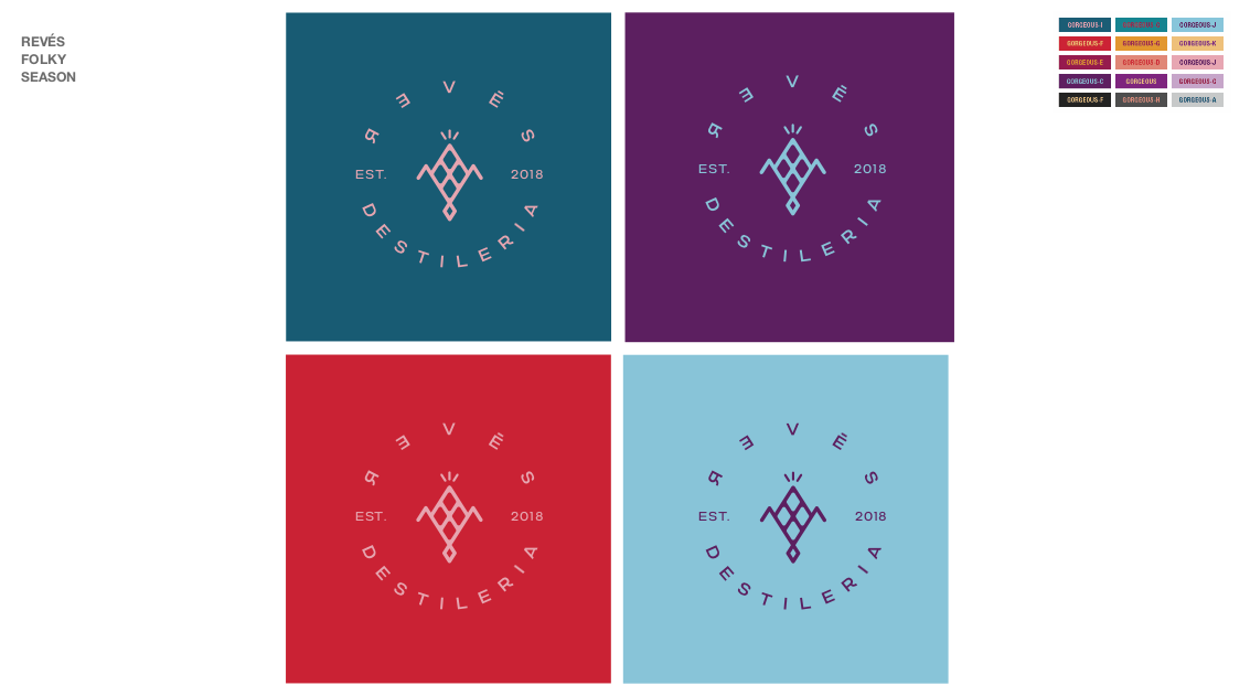
I also made some color pallete applications so the brand could stretch visually
in a more playful and modern mexican way all across different moments of the year:
*This picture up here is just for illustration purposes. Not for commercial use. Year also in this visualiazation is a placeholder.

R3VÉS WHISKY / LABEL DESIGN:
The following creative process for their whisky label is another clear example of how the old-school design methodology (drawing from scratch before vectorizing) is still the best approach, especially for visual ideas aiming to convey great craftsmanship through intricate details. Below, you'll find pencil and ink sketches that were created during the creative process for the label of this new whisky brand, also named Revés after its distillery:
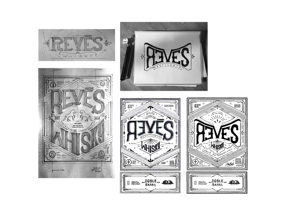
After deliberating over various details in the main idea, we ultimately decided to vectorize the master design, which could also be adapted for three different Revés Whisky recipes. I handed over the ink drawing to Carlos E. Gonzalez to translate it into vectors, as you can see here:

Scanned ink drawing file (base design) |
Last Fine-tuned and vectorized version |
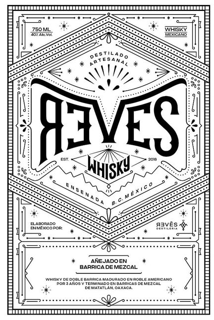
Even the barrels and the agave, the blue corn, and grapes that you see on the bottom
of each label were first hand-drawn and then vectorized:
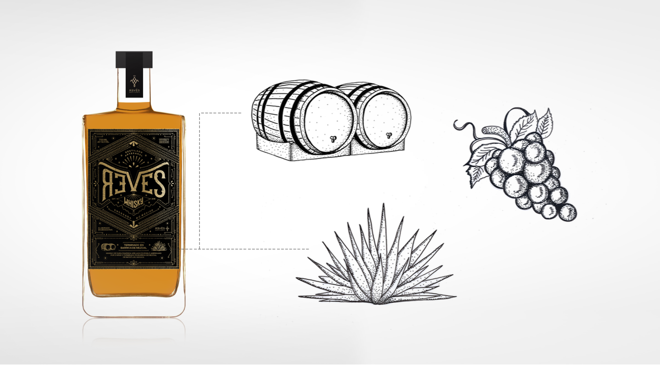
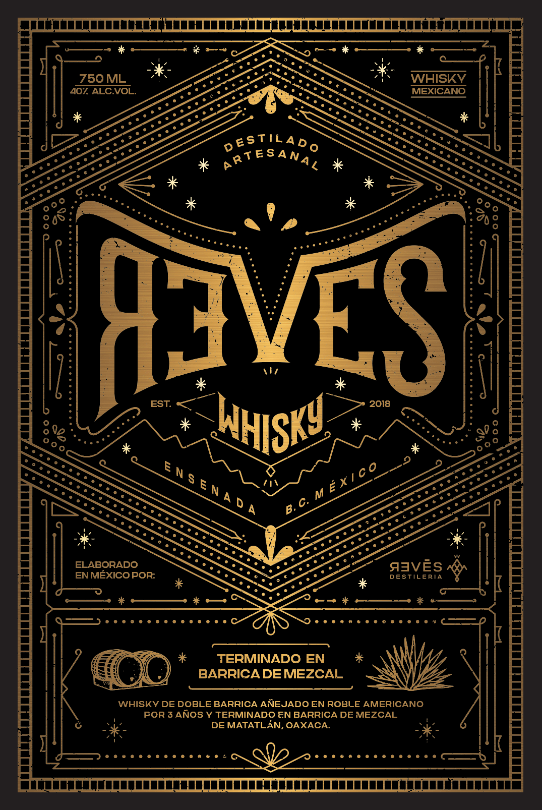
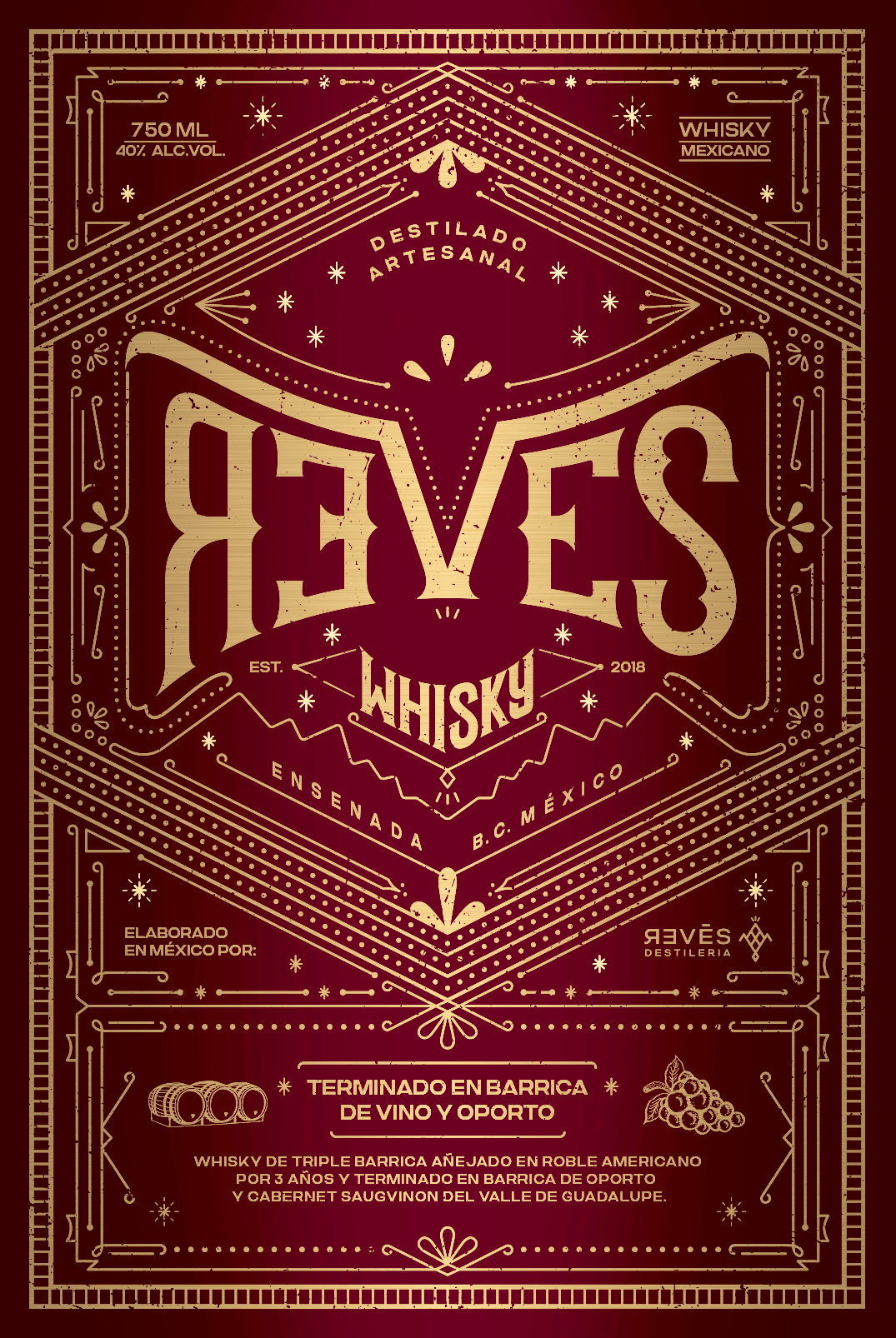
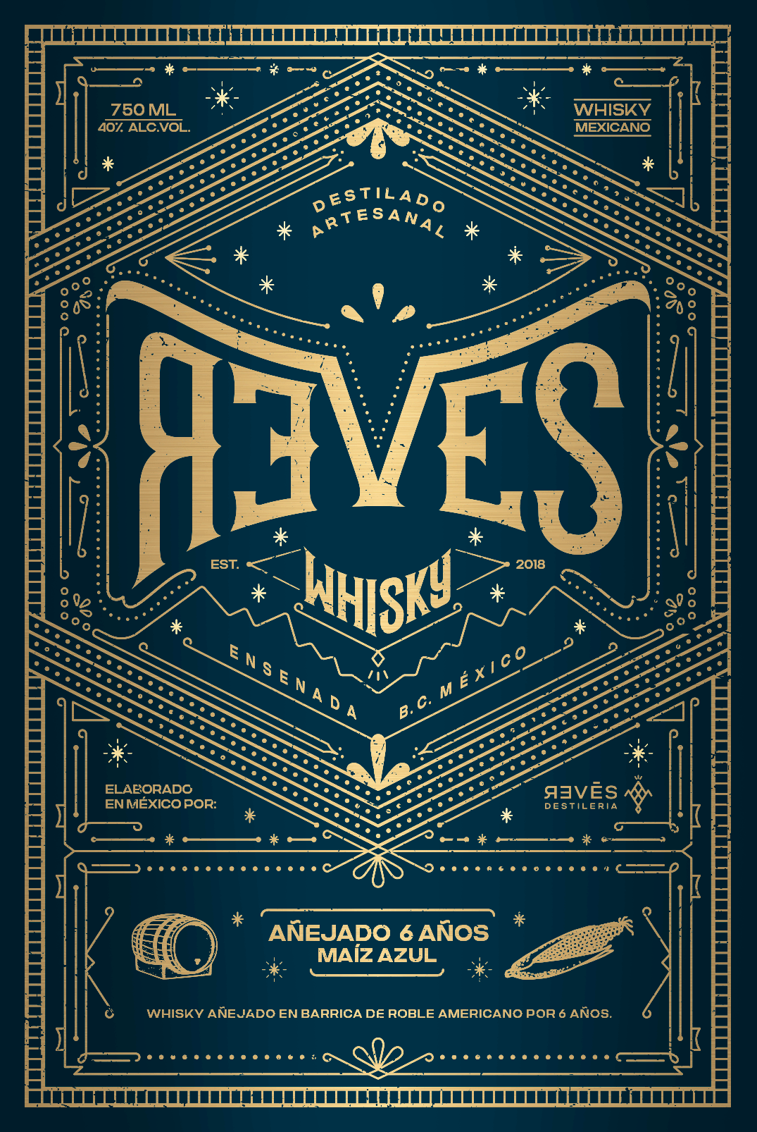
Once it was vectorized and all information approved, we picked together a color palette according to the characteristics of each whisky to finish the work. Color Pallette: Classic full black, deep oporto red, and mexican blue corn with metallic distressed foil in each one of them. Check the final label design in these beautiful gifs:
|
|
|
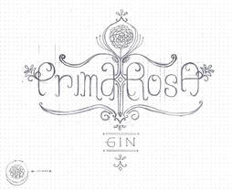
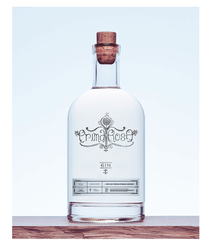
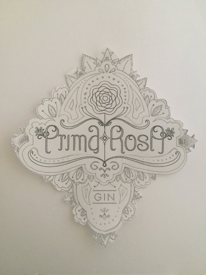
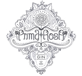
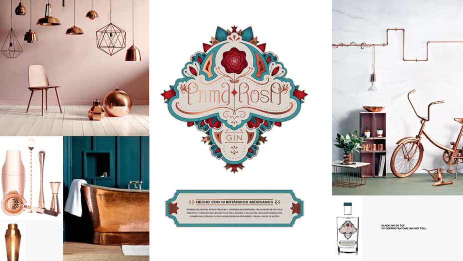
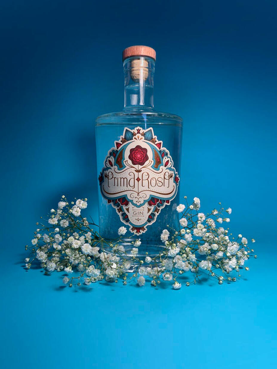
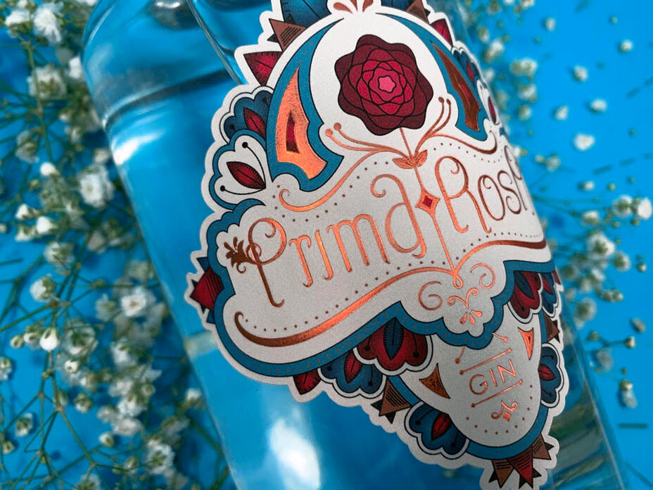
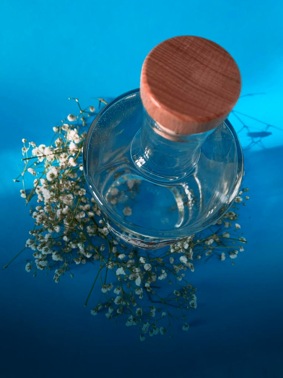
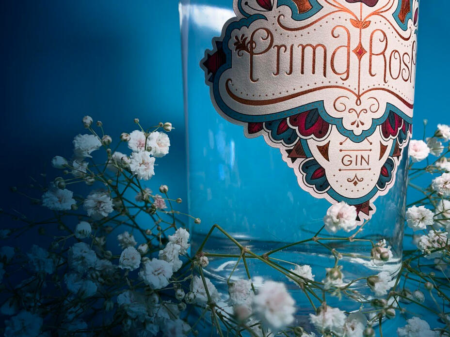
PRIMA ROSA GIN / LABEL:
A combination of art noveau, art decó, gothic and barroque style was the inspiration to create the following spirit label design. The creative process also started with several visual concepts until we found the one to fine tune:
|
|
|
|
Prima Rosa Gin is made out of 10 different and very local mexican botanicals, a super crafted and complex formula that reminds us how things were done with quality and attention to detail back in the day.
*Picture above is just for illustration purposes. Not for commercial use.
The idea on this label was to transmit that same feeling too. The final color palette are burn reds all along with beige and blues playing also with copper foil to give a premium old school finish:
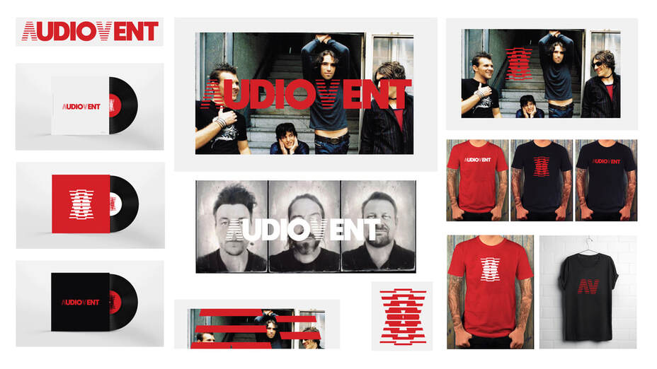
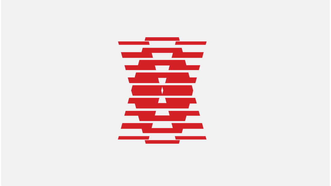
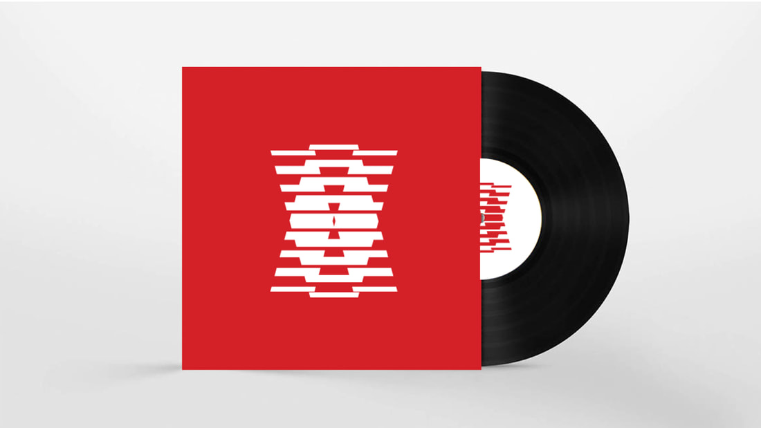
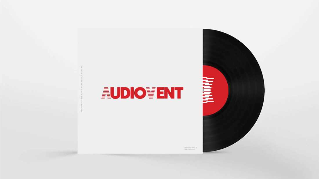
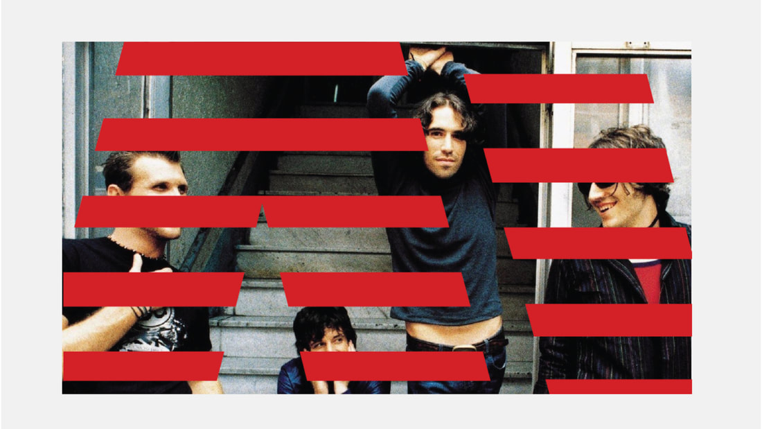
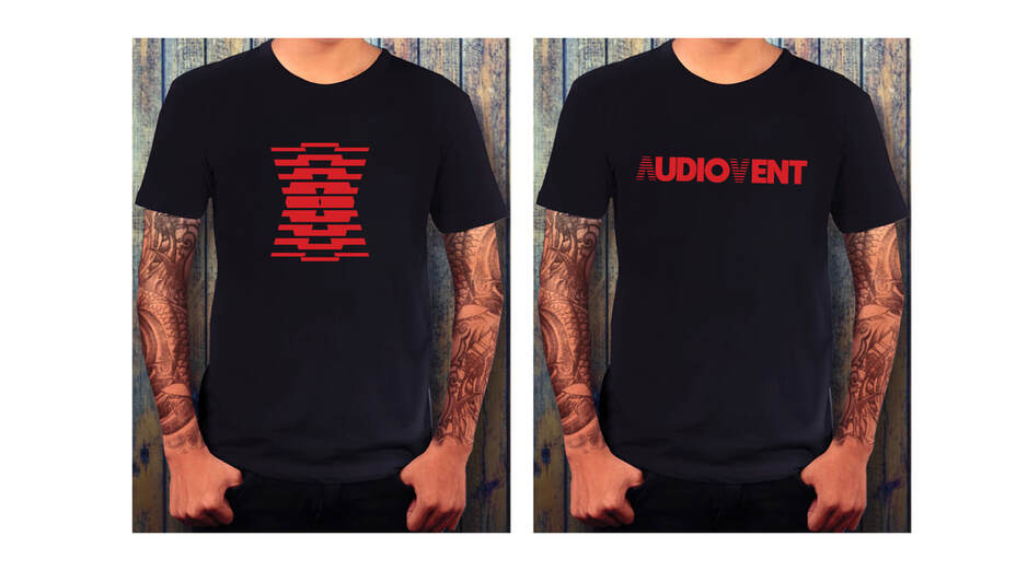
AUDIOVENT 90'S USA ROCK BAND / NEW LOOK / PITCH PROPOSAL:
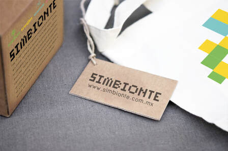
SIMBIONTE ECO-TECH FESTIVAL / IDENTITY / PITCH PROPOSAL:


|


|
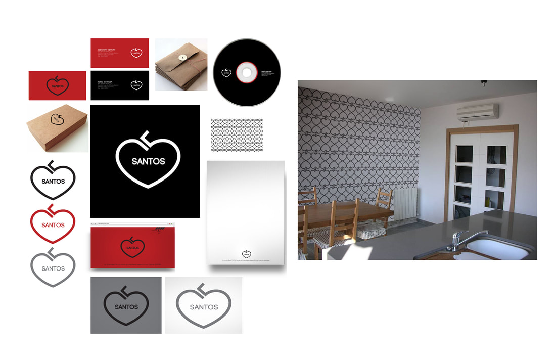
SANTOS PRODUCTION COMPANY / IDENTITY / PITCH PROPOSAL:

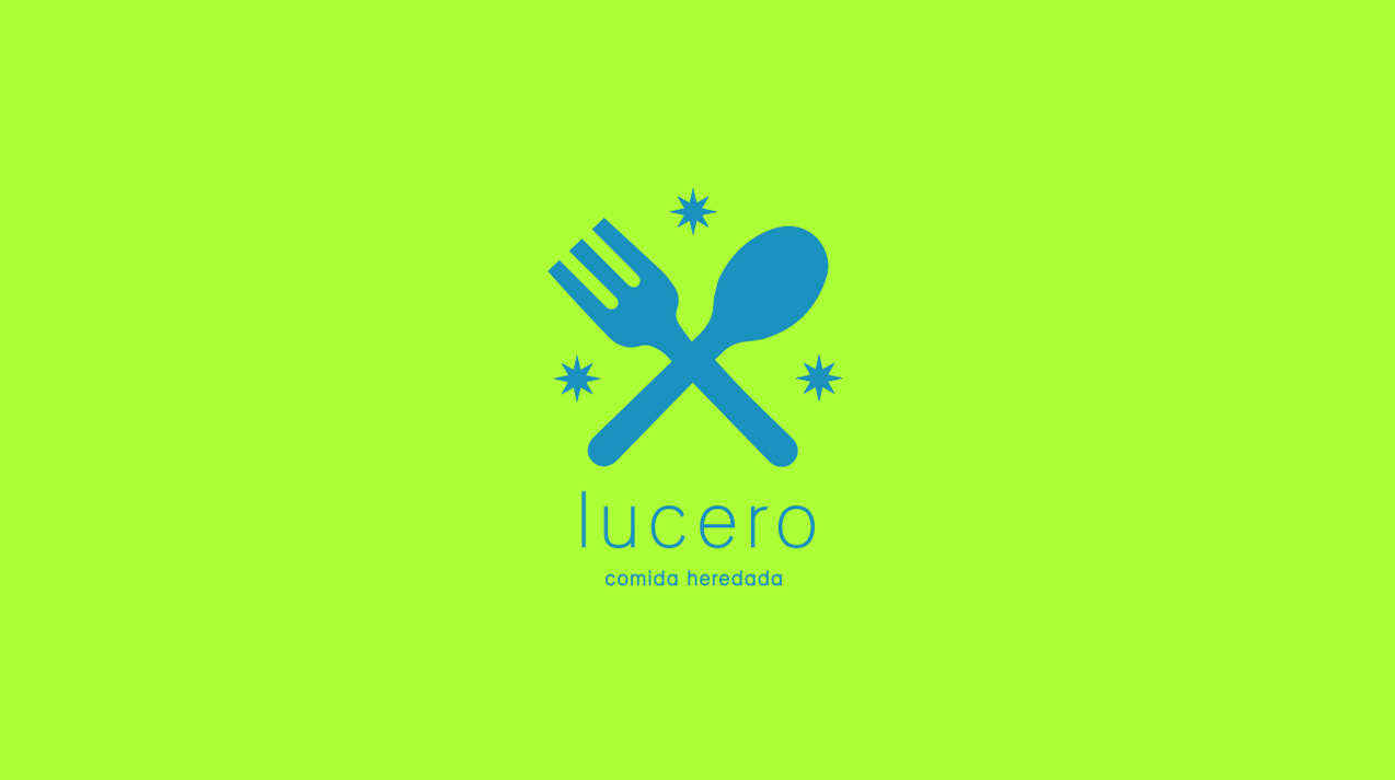
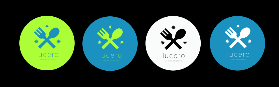
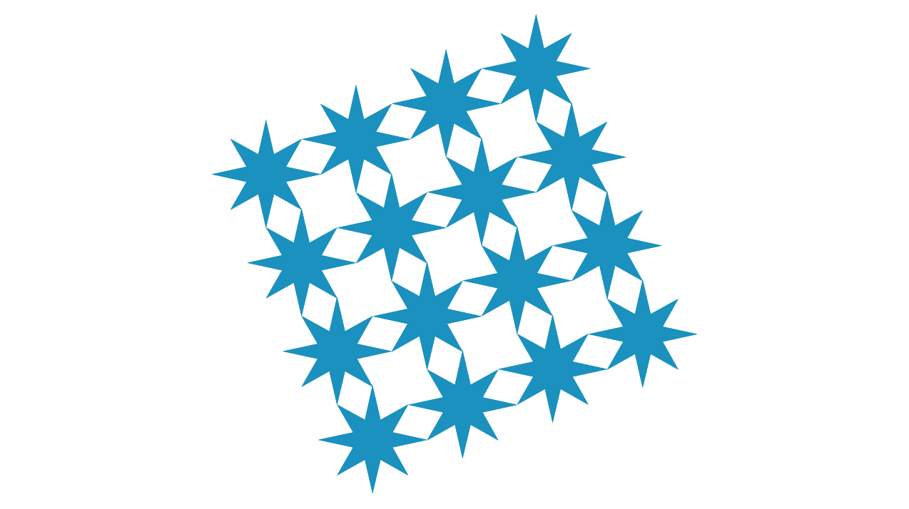
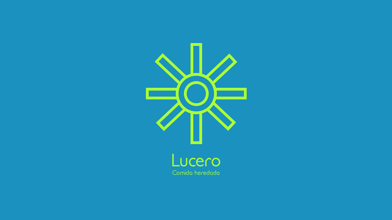
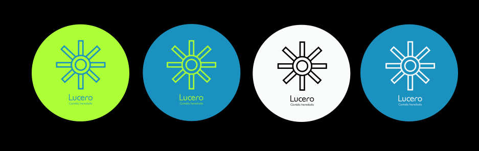
LUCERO RESTAURANT / IDENTITY PROPOSALS:

FUN PRODUCTION COMPANY / IDENTITY:


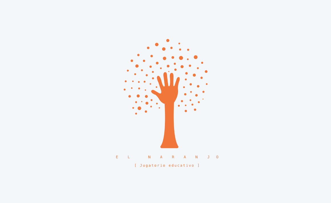
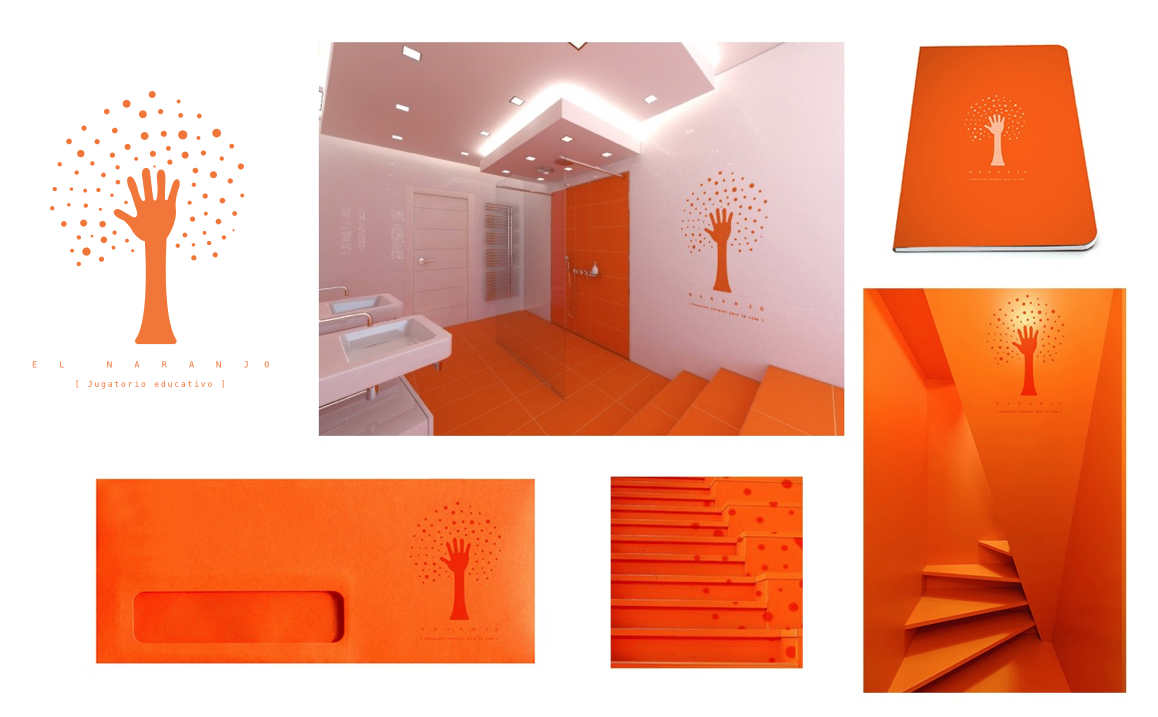
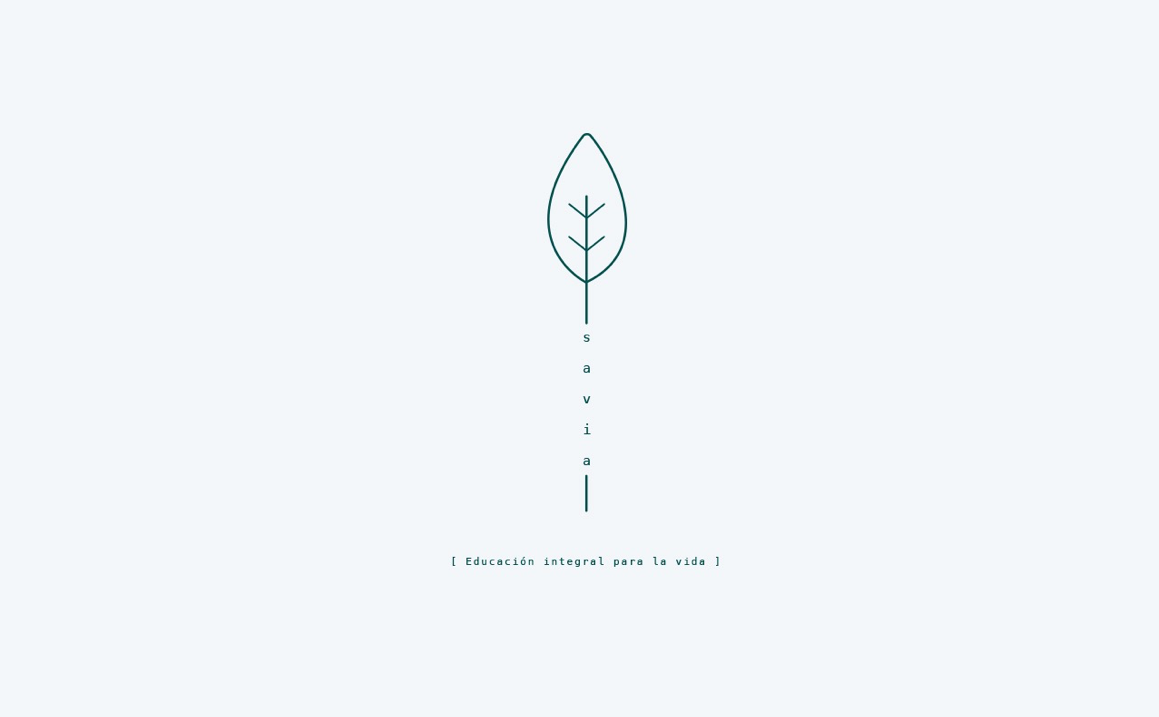
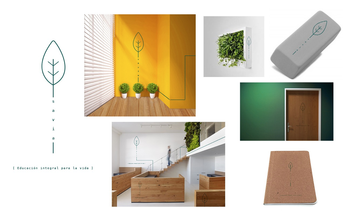
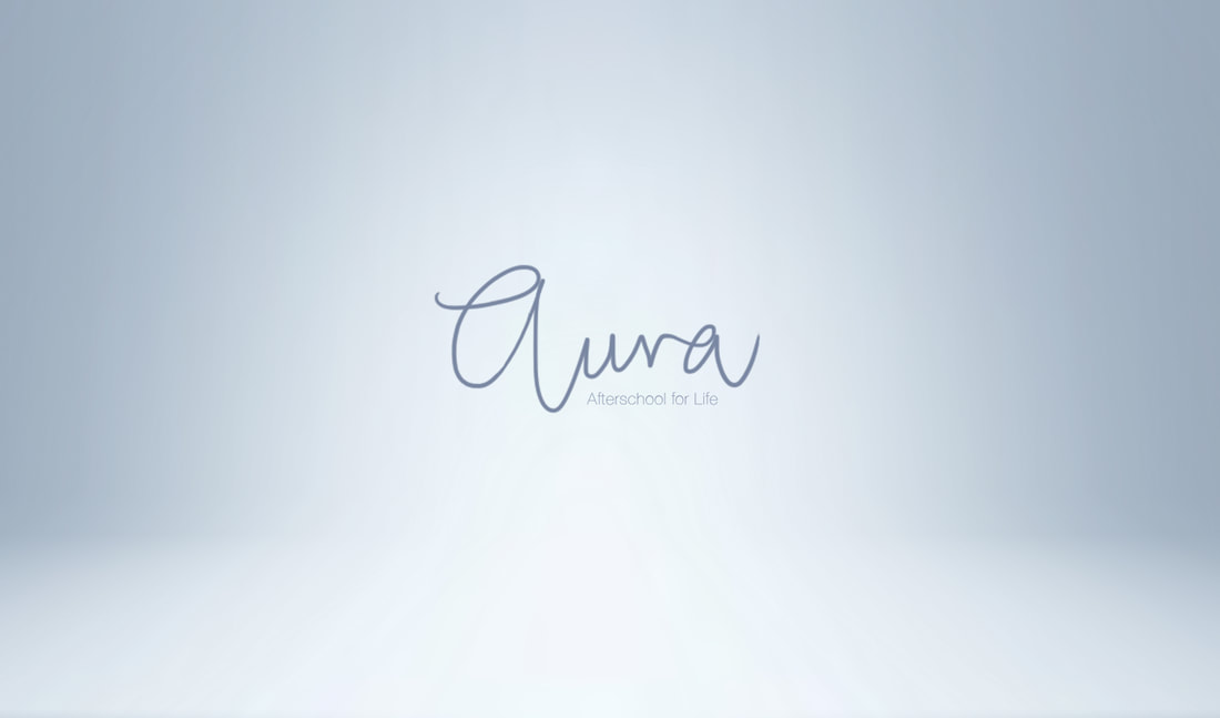
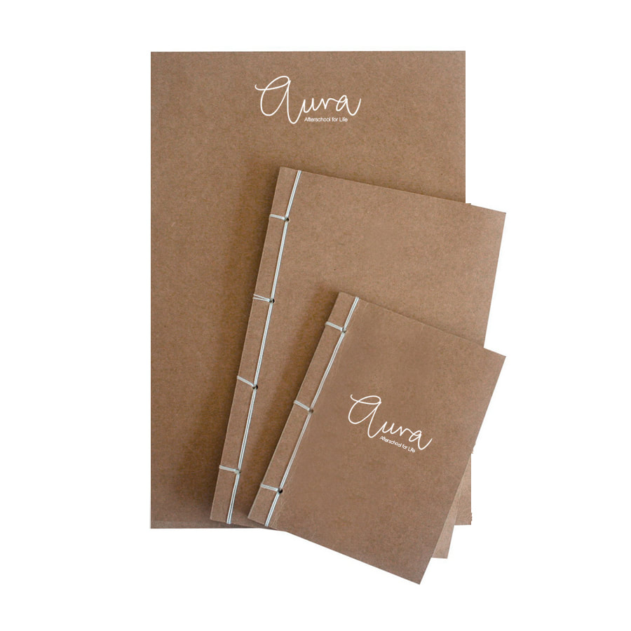
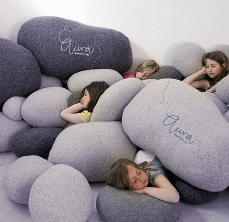
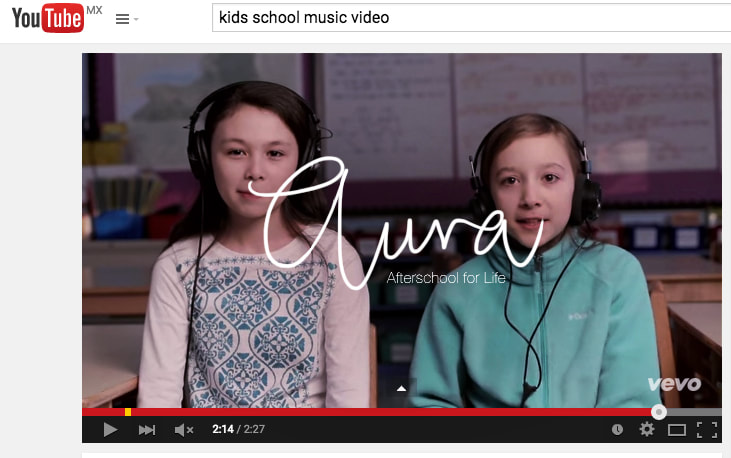
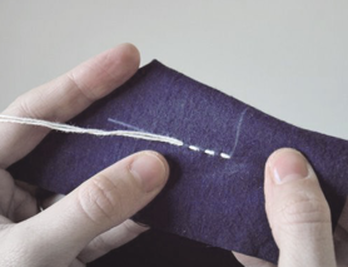
AFTERSCHOOL / NAMING & IDENTITY / PROPOSALS:
|

|

|
|
